Visual Identity
Logo
DownloadOur logo is one of the most visible elements of our identity, both a nod to our history and our ambitious future.
Primary Logo

Secondary Logo

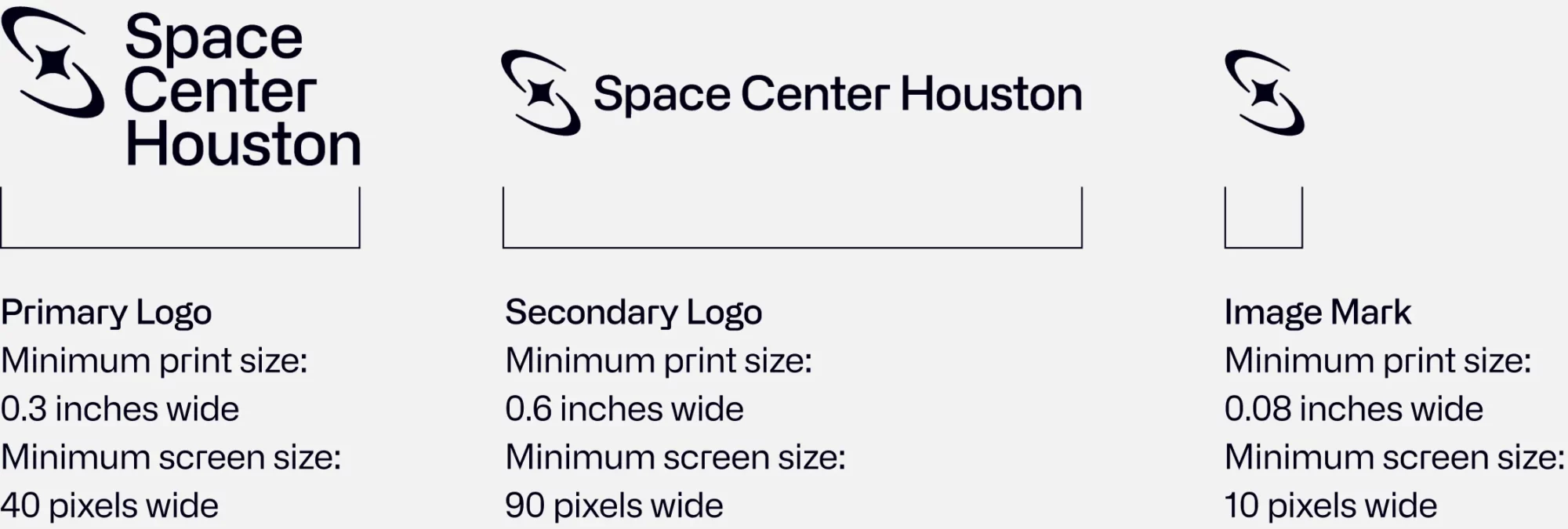
The secondary logo should only be used in rare circumstances when the primary logo is not suitable. For instance, when placed down the length of a narrow space like a pen or pencil.
Image Mark

The brand’s image mark is named the “Nova”. It can be used in isolation from the word mark on a limited-basis in applications such as step and repeat banners or on select merchandise.
Logo Clear Space and Minimum Size
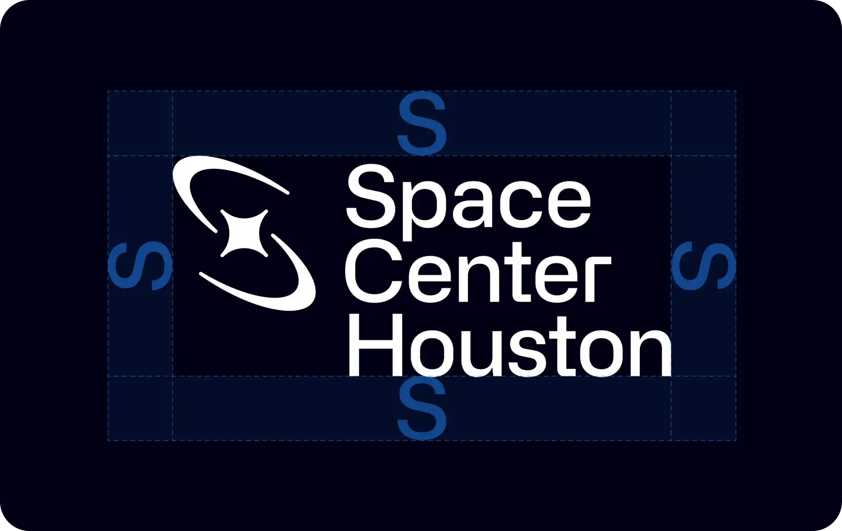
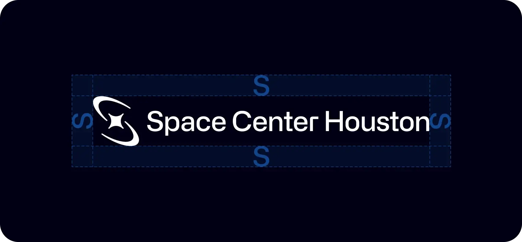
To ensure high visibility and an uncluttered presentation, always maintain clear space around the Space Center Houston logo. Determine clear space by measuring the height of the capital “S” in the logo (see diagram) and keep a square area equal to this height clear on all sides of the logo. Note that the clear space will change depending on the size of the logo.
Logo Incorrect Usage
To maintain the integrity of the brand, avoid manipulating or modifying the Space Center Houston logo. These examples are select instances of incorrect usage of the logo.
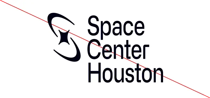
Do not modify the logo
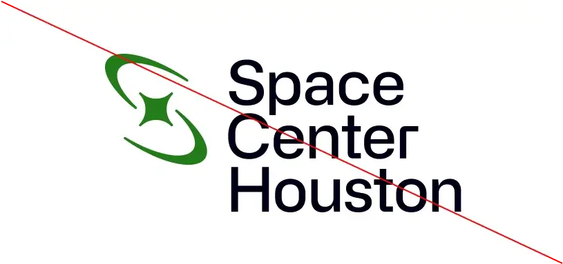
Do not recolor the logo
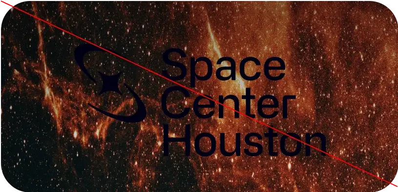
Do not place the logo on top of a background or imagery that would compromise legibility
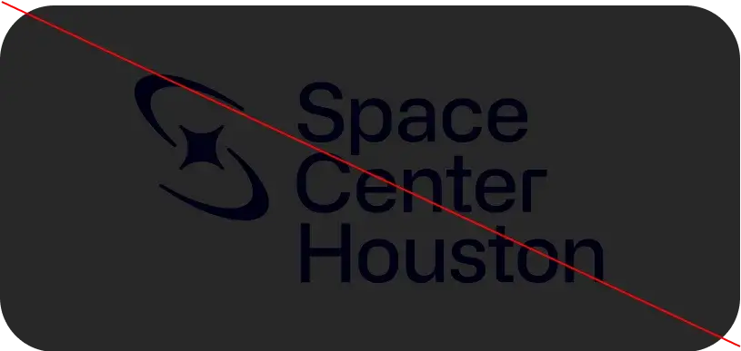
Do not place the logo on top of a low-contrast brand colors or non-brand approved colors
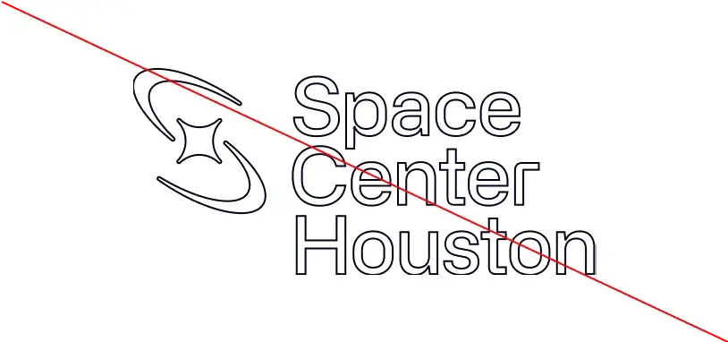
Do not apply effects to the logo such as a stroke, emboss, drop shadow, or any other effect that would compromise legibility
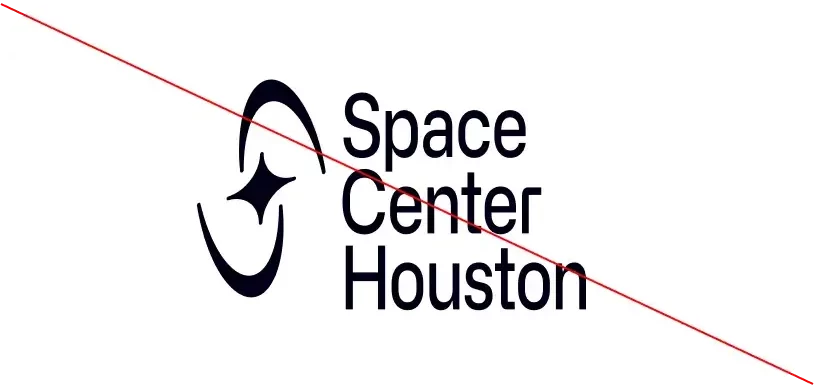
Do not rotate, skew, or alter the logo in any way
Logo Color Usage
The Space Center Houston logo should always appear in a single color treatment.
Primary Color Applications
Black on blue
This combo is ideal for digital materials. White on blue is preferred in print only.
Black on white
Black on light blue
Black on light gray
Black on extra light gray
White on blue
This combo is ideal for print materials. Black on blue is preferred in digital only.
Merchandise-specific Color Applications
When creating merchandise the “Primary color applications” shown above are strongly encouraged, however the following color applications are also available but only approved for use in specific merchandise instances. Consult the Marketing/Communications department for approval when applying the following color ways.
Blue on black
Blue on white
Blue on light blue
Blue on light gray
Blue on extra light gray
Partnership Lockup
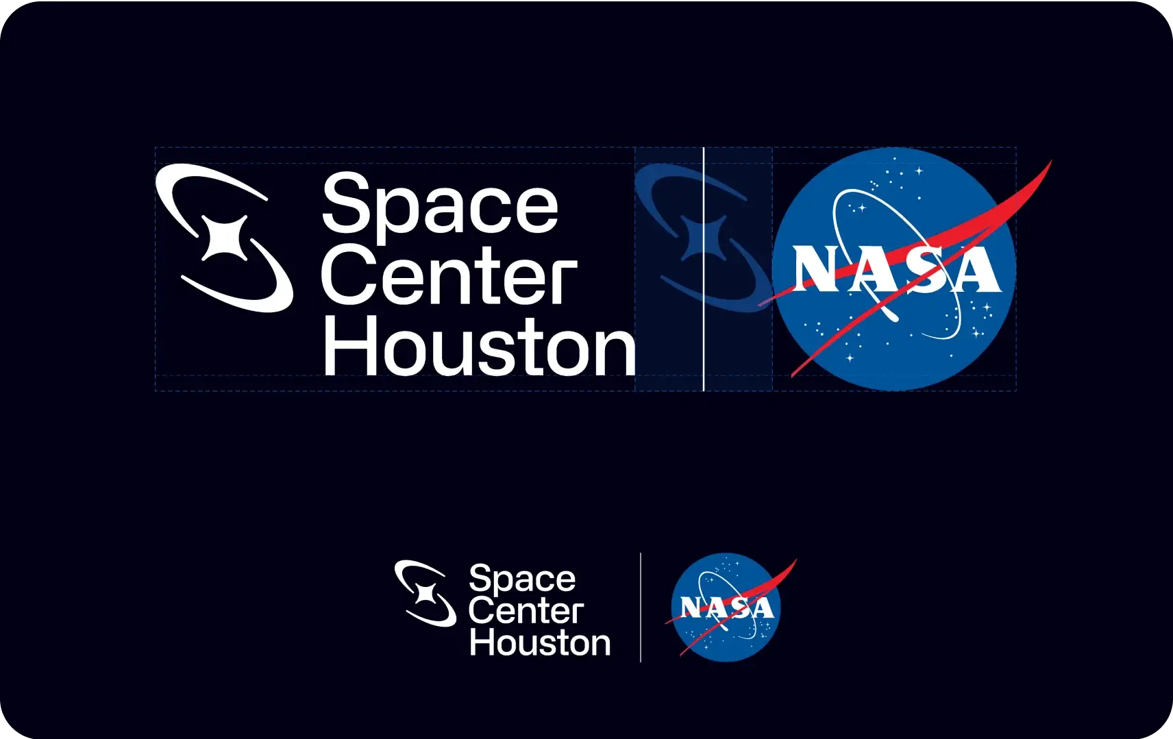
Partnership logos should be visually balanced with the Space Center Houston logo, while respecting the clear space zones. We lock up the partner’s logo by placing it to the right of the Space Center Houston logo using the width of the Nova image mark to measure the distance between. A vertical line is positioned within the center width and extends just beyond the height of the Space Center Houston logo.
Color Palette
DownloadConsistent use of color will help unify all applications of the Space Center Houston brand. Our color system is intended to provide a sleek and modern look, an approachable feel, and an overall presentation distinct from others in our industry. Remember to use RGB or Hex values for digital tactics only and CMYK or PMS values for all printed materials.
Our primary colors are Atmosphere Blue and Deep Space Black and are used as our dominant hues. To add variation and flexibility to a design, incremental tints of these colors can be used but should not overpower the design.
Primary Color Palette
Atmosphere Blue
Digital:- Hex: #1e7eee
- RGB: 30.126.238
- PMS 2727 C
- CMYK: 77.34.0.0
- PMS 285 U
- CMYK: 73.30.0.0
- Hex: #61a5f3
- RGB: 97.165.243
- Hex: #8ebef6
- RGB: 142.190.246
- Hex: #bbd8fa
- RGB: 187.216.250
- Hex: #e8f2fd
- RGB: 232.242.253
Deep Space Black
Digital:- Hex: #000014
- RGB: 0.0.20
- PMS Black 6 C
- CMYK: 100.79.44.93
- PMS Black 6 U
- CMYK: 86.69.43.100
- Hex: #4c4c5a
- RGB: 76.76.90
- Hex: #808089
- RGB: 128.128.137
- Hex: #b2b2b8
- RGB: 178.178.184
- Hex: #e5e5e7
- RGB: 229.229.231
Color Pairings for Text
Acceptable Color/Text Pairings
To ensure our content is cohesive and accessible, these color pairings are the recommended options for pairing color and text.
Heading
Subhead
Body Copy (only approved for use in print)
White on blue
Minimum text size is 19px or larger
Heading
Subhead
Body Copy
White on black
Minimum text size is 10px or larger
Heading
Subhead
Body Copy
Black on gray
Minimum text size is 10px or larger
Heading
Subhead
Body Copy
Black on white
Minimum text size is 10px or larger
Heading
Subhead
Body Copy
Black on blue
Minimum text size 12px or larger
Heading
Subhead
Body Copy
Black on light blue
Minimum text size is 10px or larger
Heading
Subhead
Body Copy
Blue on black
Minimum text size 12px or larger
Heading
Subhead
Blue on light blue
Minimum text size is 19px or larger
Heading
Subhead
Blue on white
Minimum text size is 19px or larger
Heading
Subhead
Blue on gray
Minimum text size is 19px or larger
Unacceptable Color/Text pairings
These are some instances of color pairings to avoid.
Heading
Subhead
Body Copy
White on gray
Heading
Subhead
Body Copy
Light blue on gray
Heading
Subhead
Body Copy
White on light blue
Heading
Subhead
Body Copy
Gray on light blue
Subhead
Body Copy
Light blue on white
Subhead
Body Copy
Gray on white
Body Copy
Blue on gray
Body Copy
Gray on blue
Body Copy
Blue on light blue
Typography
Typography is an important aspect of our brand identity. Our type styles contribute to our overall modern space-inspired aesthetic. Please contact the Marketing and Communications team to access fonts.
Primary Fonts
- Headlines & Subheads
- Only use selected weights: Regular & Medium
- Body Copy
- Only use selected weights: Regular, Medium & Bold
- Eyebrows & Footers
- Only use selected weights: Medium & Demibold
- Large Numbers
- Only use selected weights: Light & Medium
Alternate Fonts
Arial serves as a recommended alternative system font with qualities that resemble Alliance. Arial can be used in Word documents, email templates, and other documents when Primary fonts are not available.
- Headlines & Subheads
- Only use selected weights: Regular
- Body Copy, Eyebrows, & Footers
- Only use selected weights: Regular & Bold
Type Hierarchy
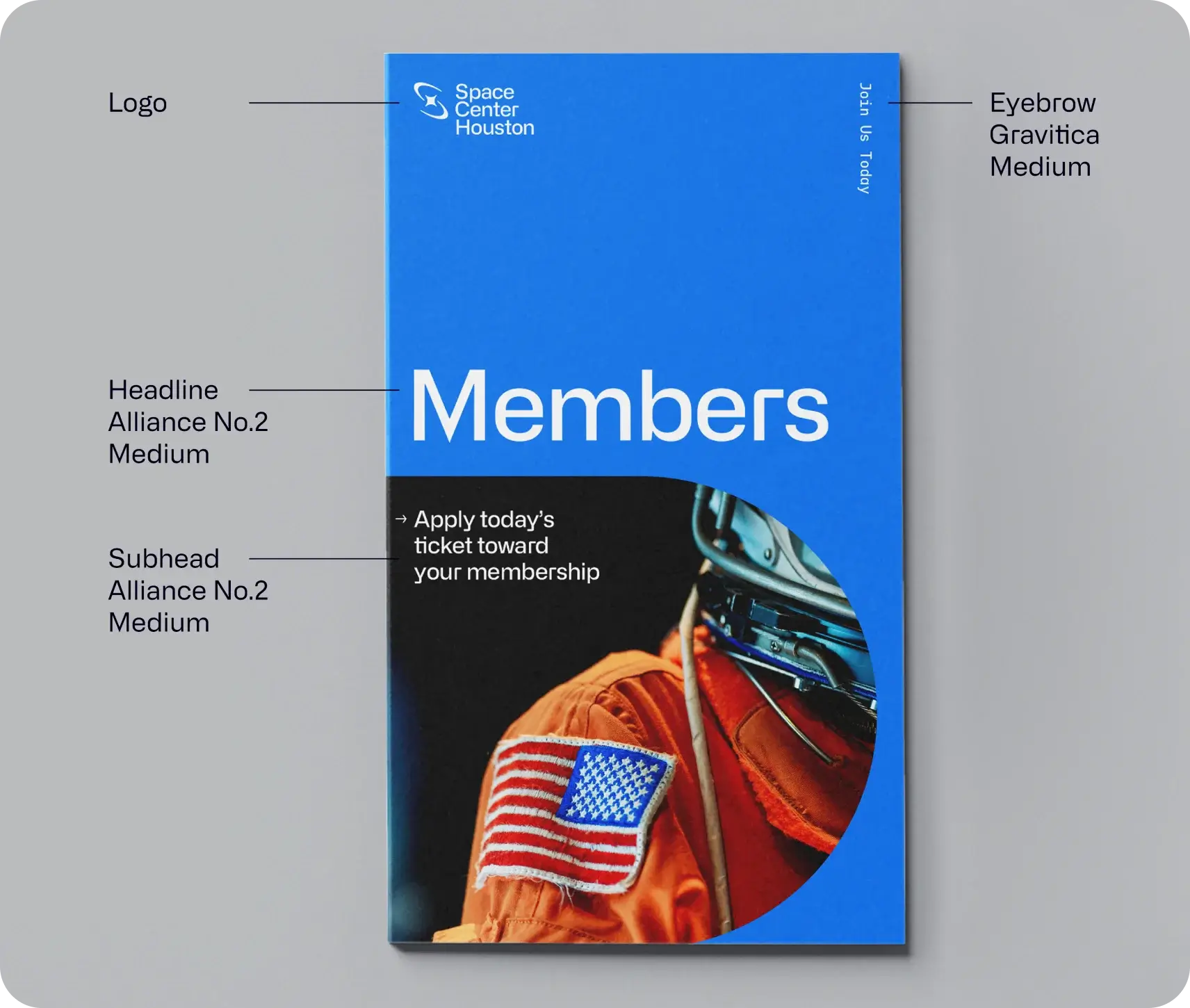
Type hierarchy is important to establish balance and direction of messaging to our guests.
Special Type Treatments
Typographic accessibility is paramount when presenting key information such as wayfinding and/or schedules, for instance. When designing content that is vital to be read, please avoid the following treatments. However, there are certain instances when non-essential text can be added to a layout to enhance the aesthetic tone of the design. In these cases the primary function of the text is not meant to be “read” or “understood” (these become secondary functions) but instead is intended primarily to create a “feeling” or “vibe”. In these instances, the following treatments are available to be used.
Outlined Text
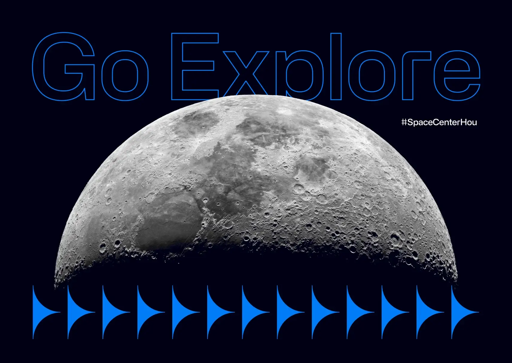
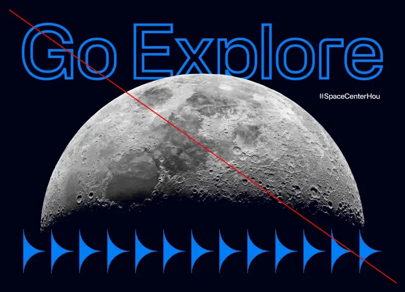
Do not over thicken the outlines.
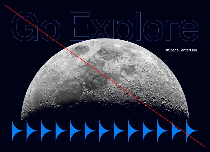
Do not use too thin a stroke.
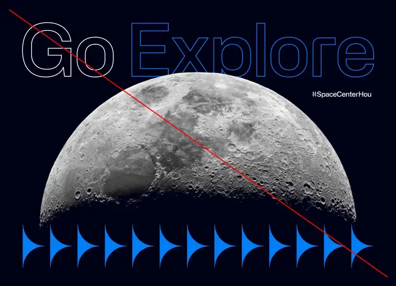
Do not use multiple colors in an outline treatment.
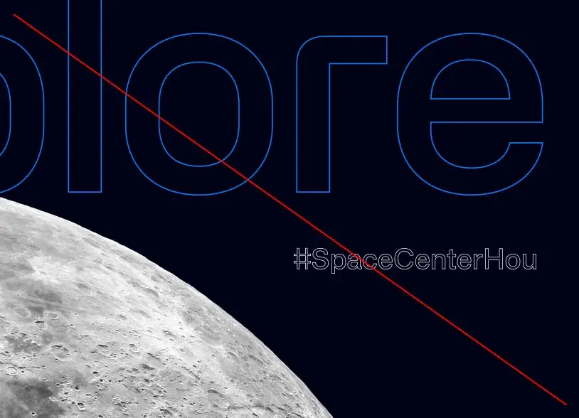
Do not apply outlines to small text. Do not apply outlines to more than one text graphic in a single layout.
Vertical Text
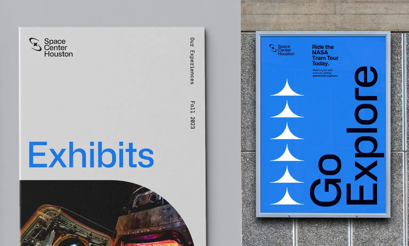
Example 1:
Vertical Eyebrow text, top alignment
Example 2:
Vertical Headline, bottom alignment
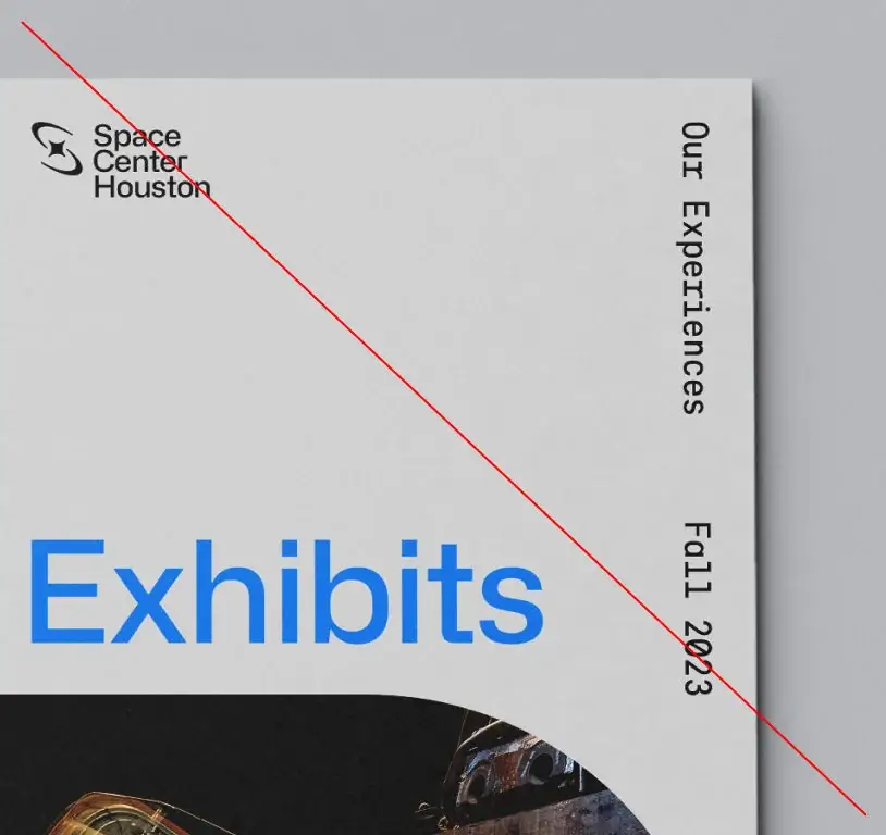
Do not scale vertical Eyebrow text too large
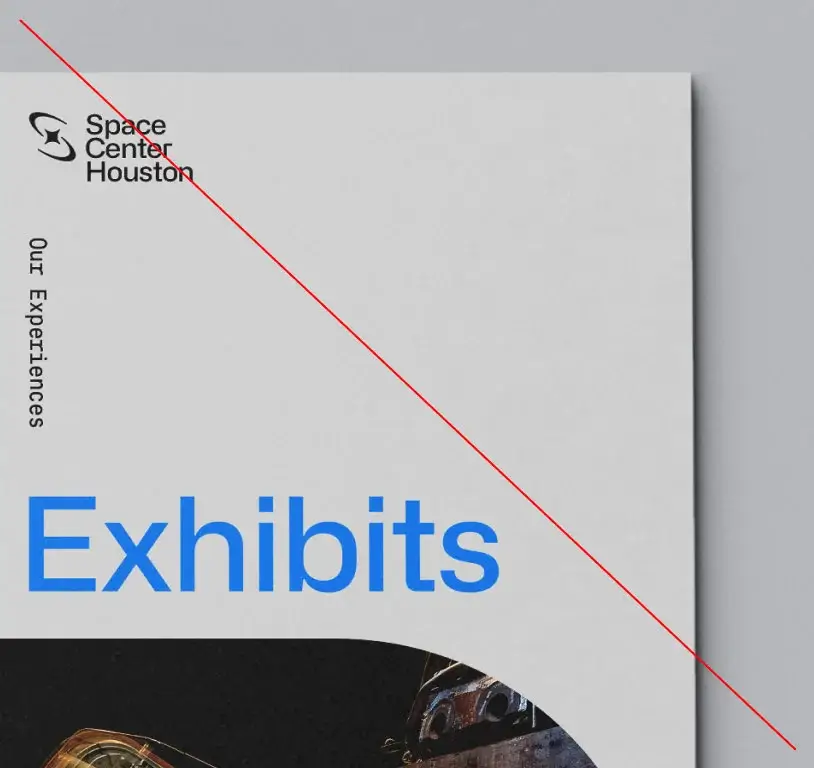
Do not anchor vertical text on the same side as too many other elements. Opposing sides of content areas tend to be optimal placements.
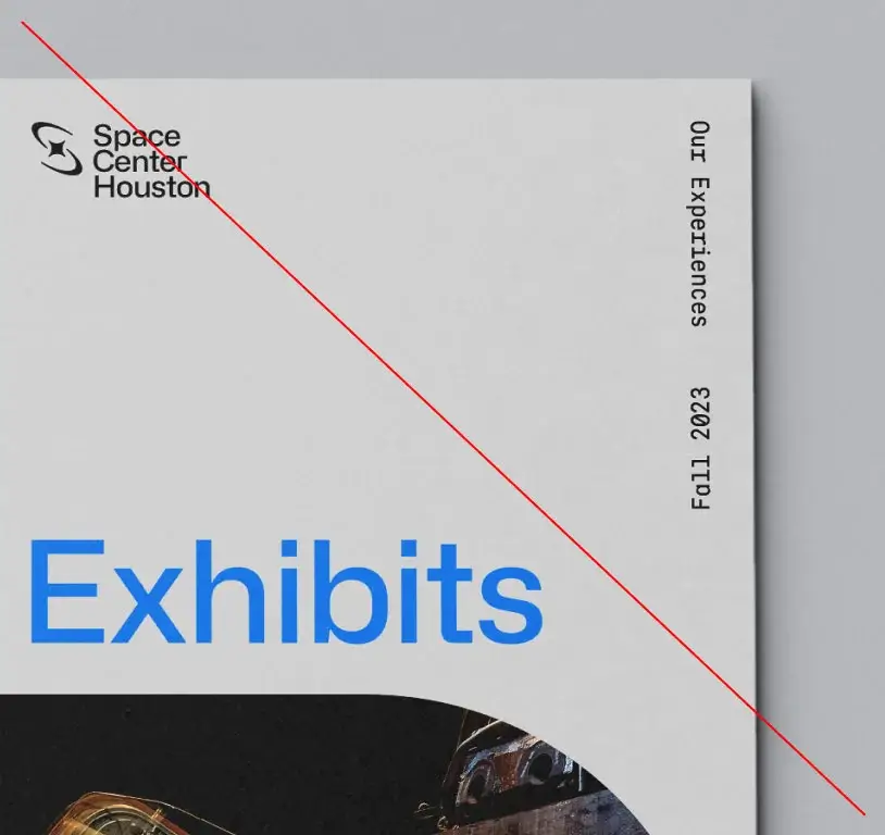
Do not use opposing vertical text directions within the same application
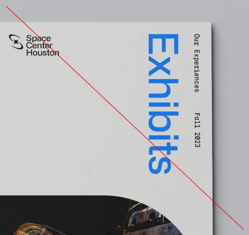
Do not place multiple pieces of text in
a vertical format
Brand Shapes
DownloadOur brand shapes are a fundamental part of our brand’s graphic system. These brand shapes take inspiration from the Space Center Houston logo’s grid; extracting, expanding and evolving them from some of the forms within that structure.
Logo Grid
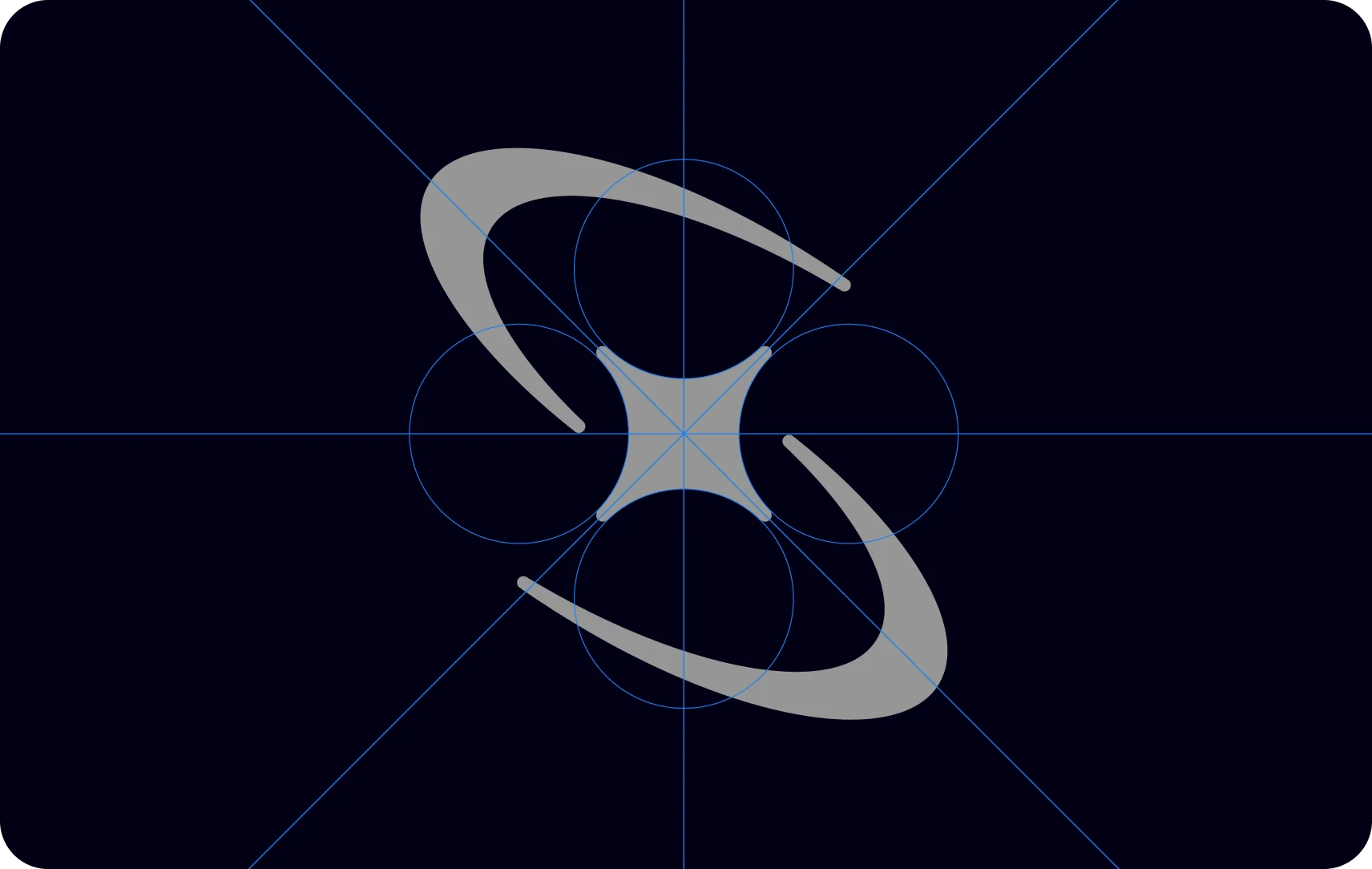
Brand Shapes
The brand shape library can be utilized in a myriad of ways: as encasements for imagery, container shapes for content, patterning, and more. They can be rotated at increments of 45 to 90 degrees, cropped, scaled and used in both solid fill and outline.

Brand Shape Treatments
Here are some of the ways the brand shapes can be utilized.
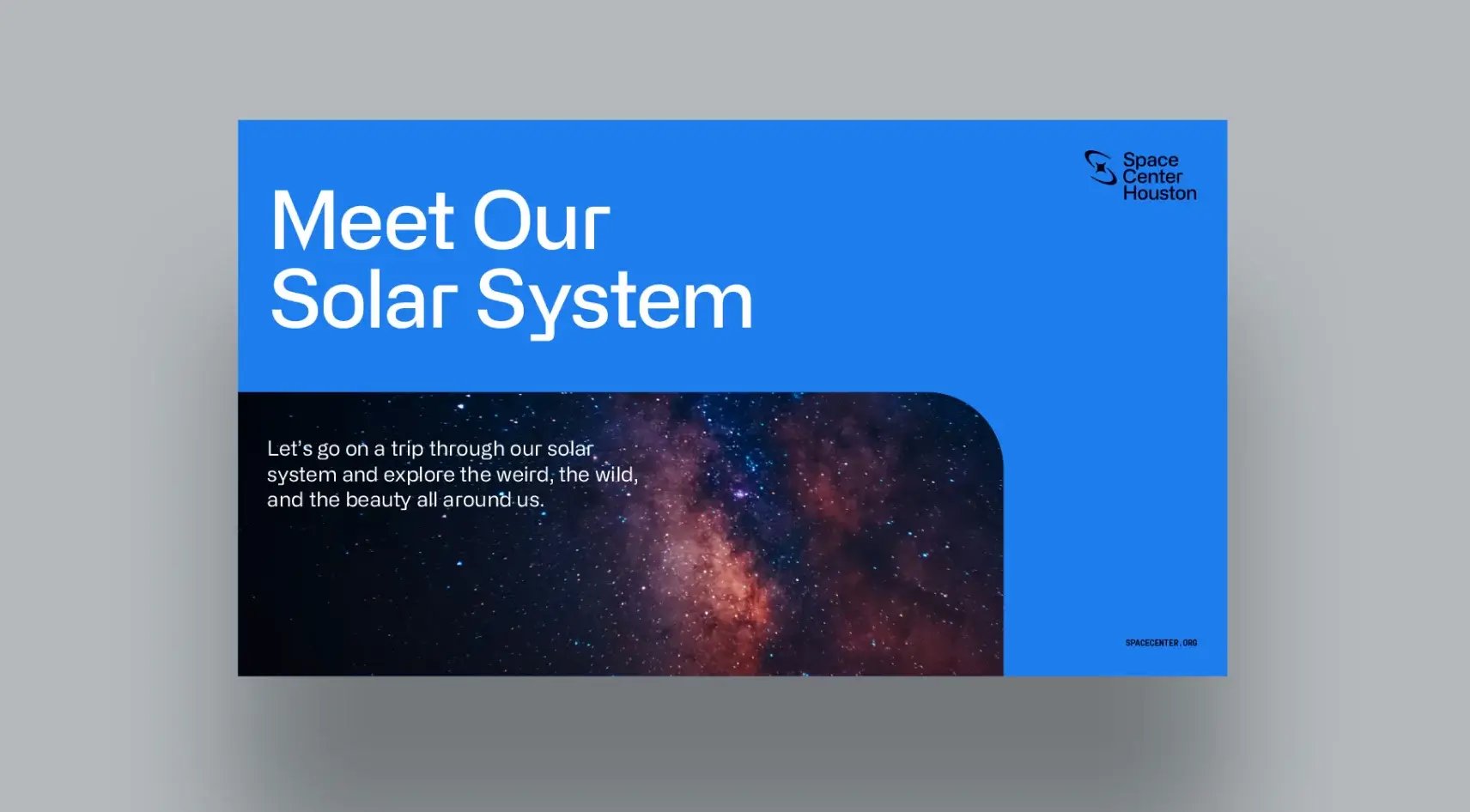
Shape image encasement
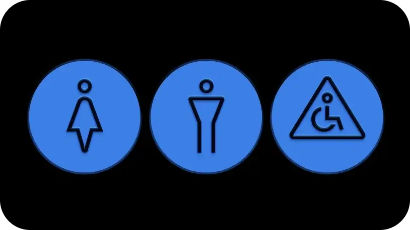
Shape icon encasement
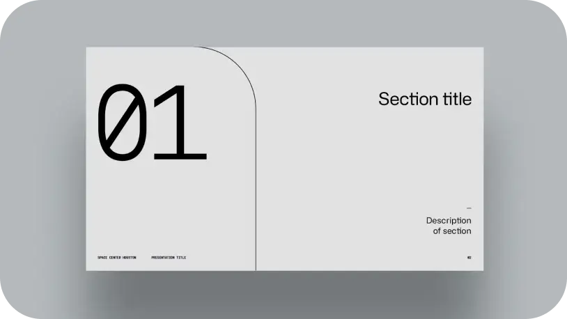
Shape text encasement
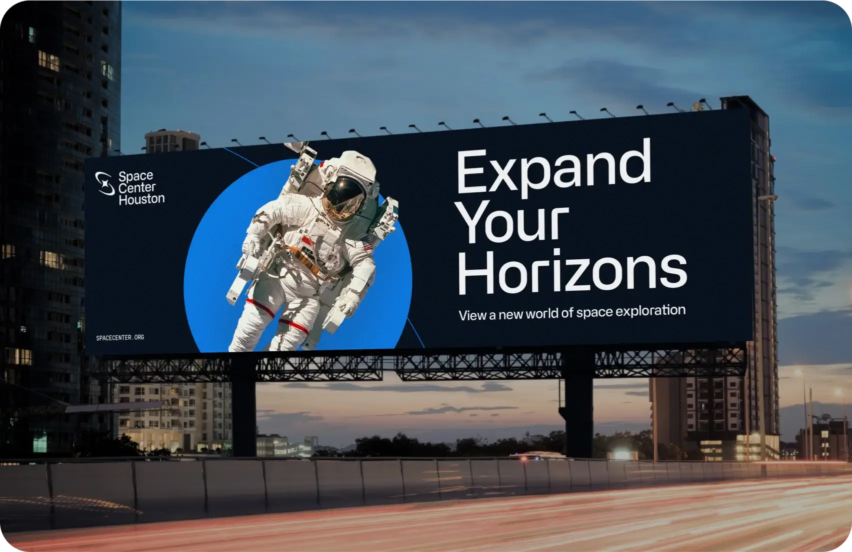
Shape image layering
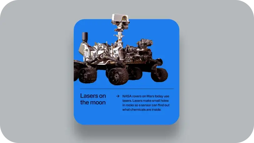
Solid shape
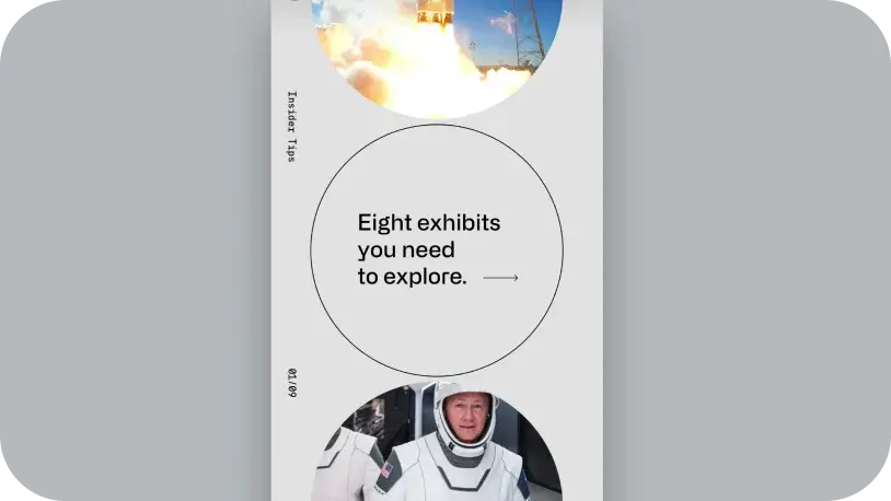
Outlined shape (center circle example)
Brand Shape Incorrect Treatments
Here are some of things to avoid when using the brand shapes.
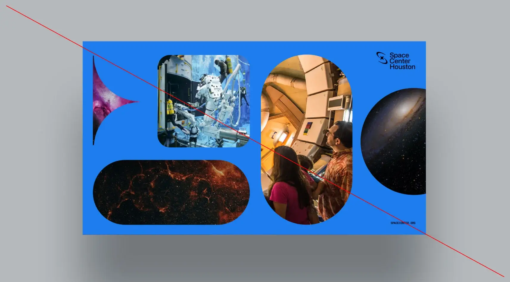
Do not combine too many different shapes in one layout
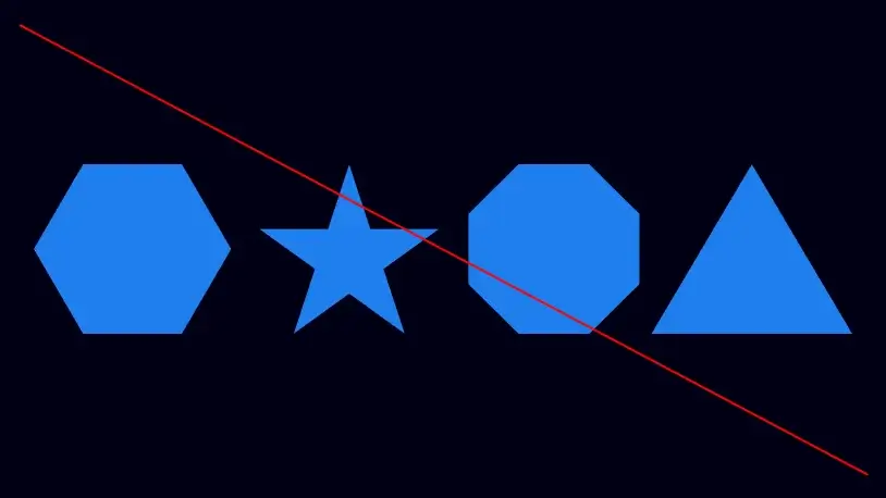
Do not use non-brand approved shapes
as primary graphics
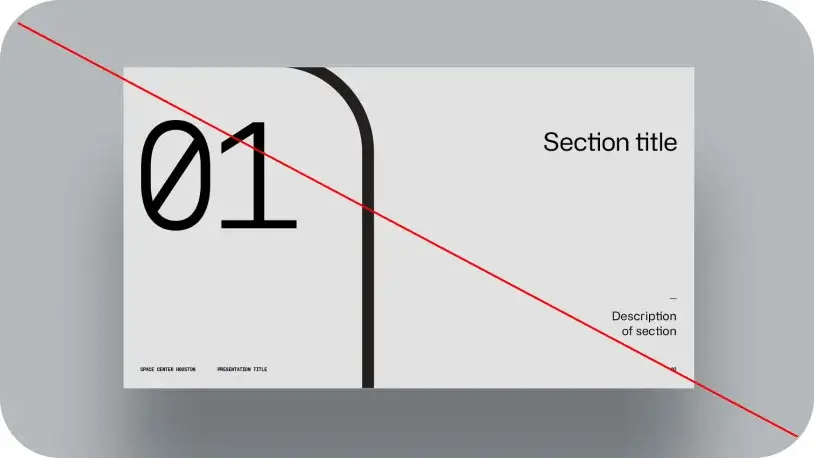
Do not over thicken shape outlines
Brand Patterns
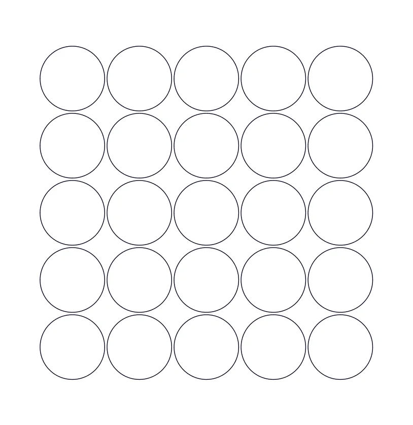
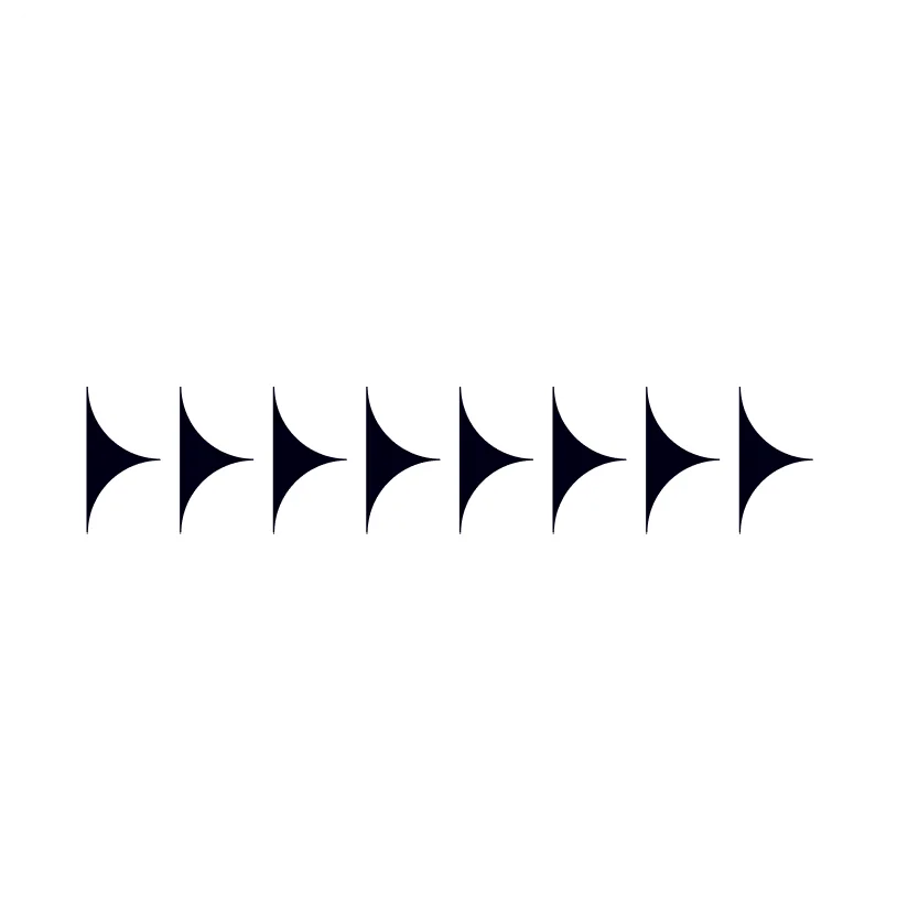
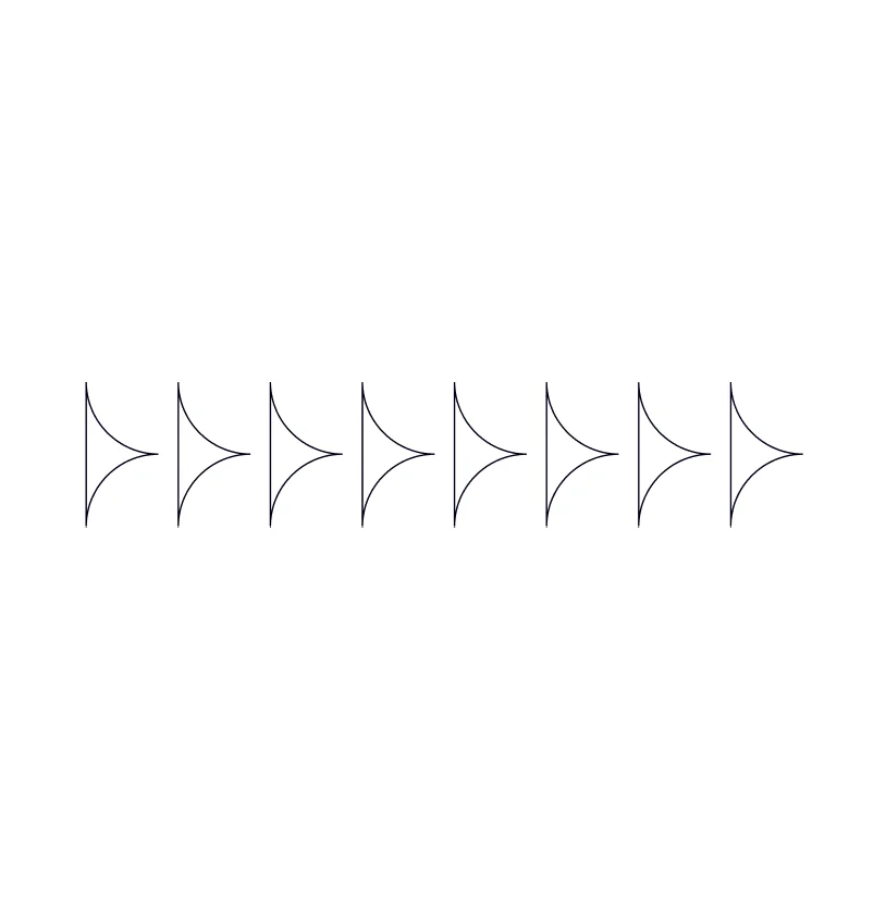
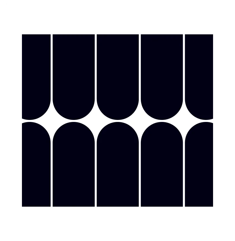
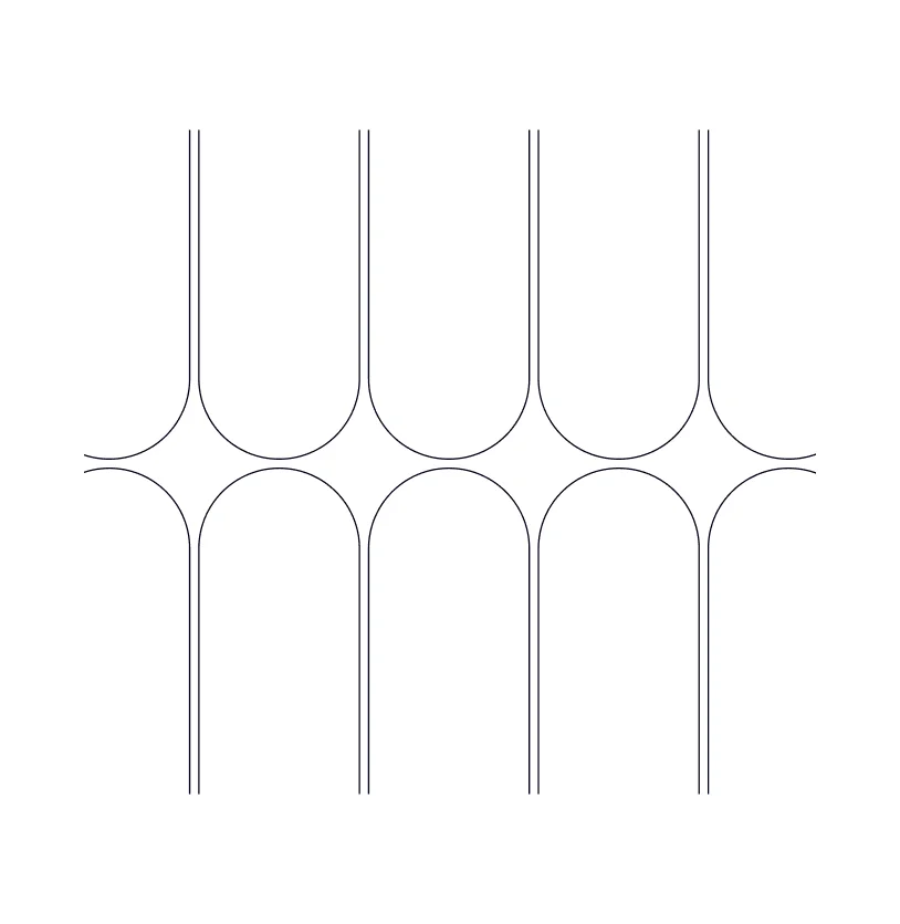
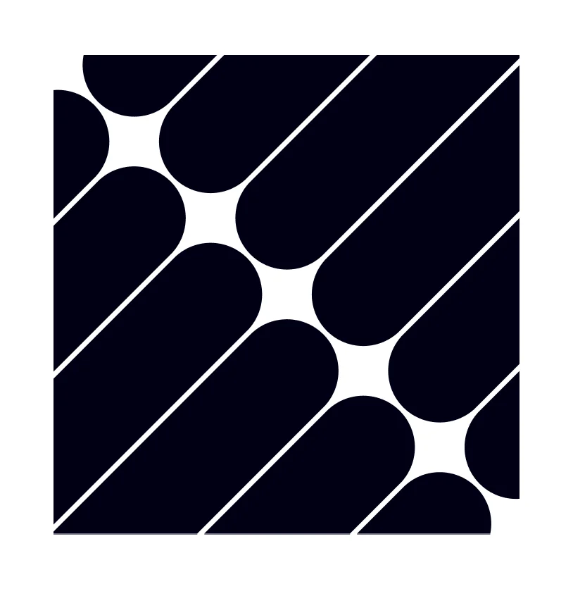
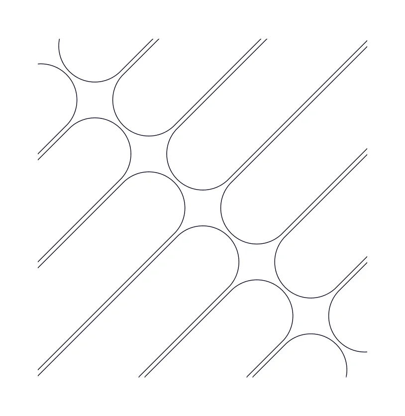
DownloadOur brand patterns leverage select brand shapes to create dynamic visual interest in layouts. Brand patterns can be used to encase imagery, applied as both solid fills and outlines, and be arranged in different directions, scales, and crops.
Pattern Library
Macro circles: solid fill
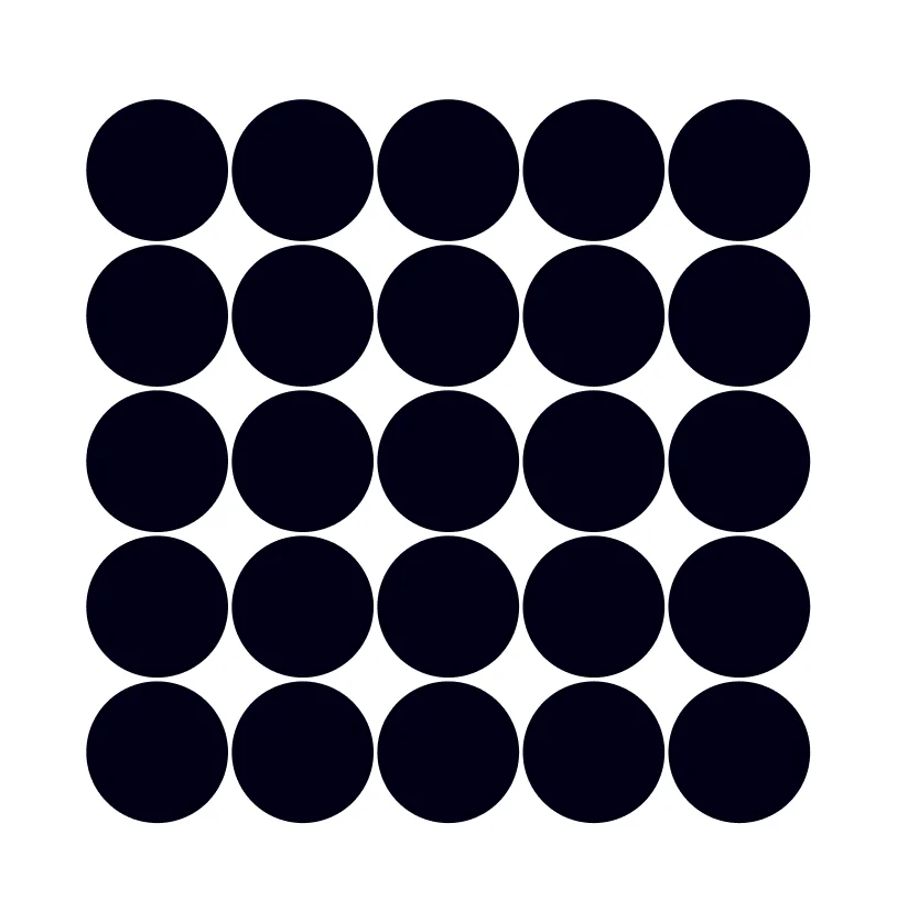
Macro circles: outlines
Arrows: solid fill
Arrows: outlines
Vertical capsules: solid fill
Vertical capsules: outlines
Diagonal capsules: solid fill
Diagonal capsules: outlines
Brand Pattern Treatments
Here are some of the ways the brand patterns can be utilized.
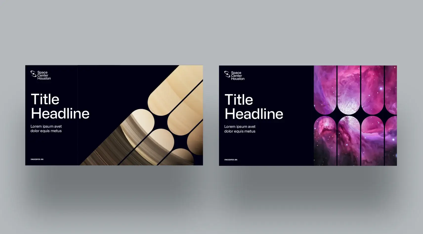
Pattern image encasements
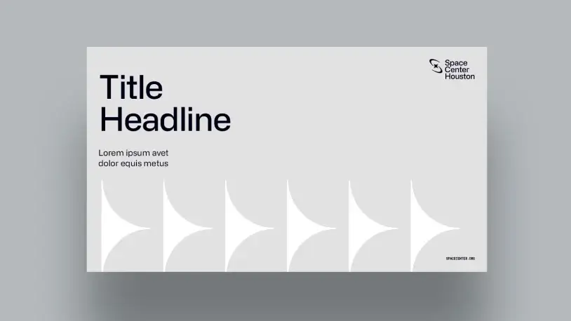
Solid fill pattern
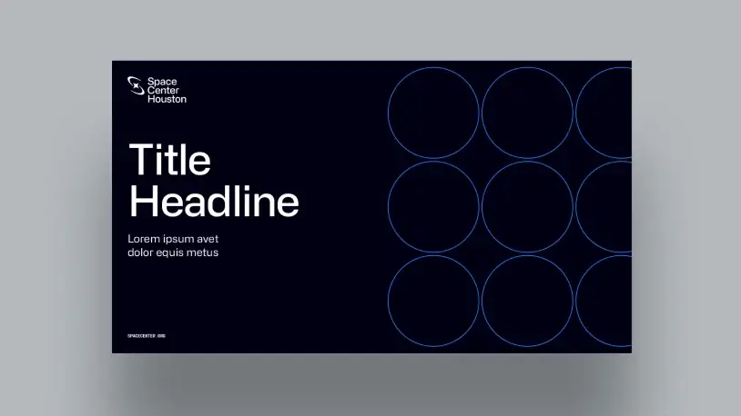
Outlined pattern
Brand Pattern Incorrect Treatments
Here are some of things to avoid when using the brand patterns.
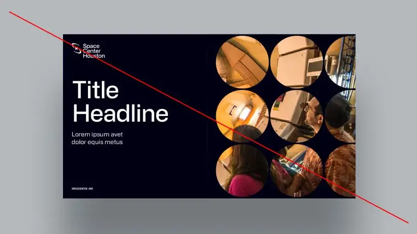
Do not use overly complex or busy images
within the pattern crops
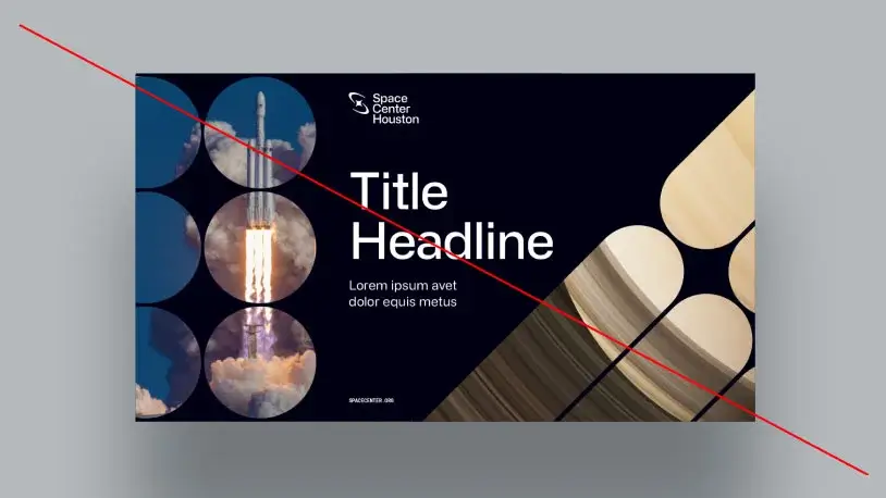
Do not combine multiple patterns
within a single layout
Icons
DownloadOur icons are created in a modern monoline style and generated using a consistent pixel grid to assure consistency as the library expands.
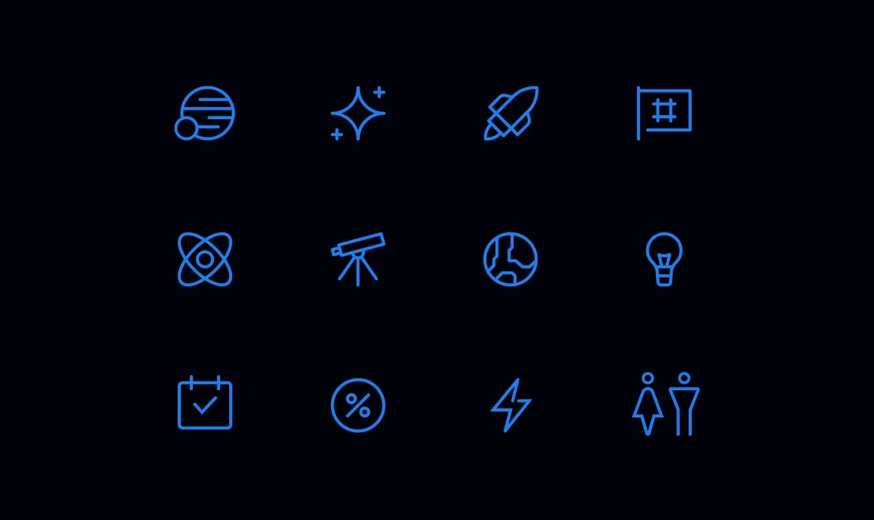
Our icons should be simple, not overly complex or detailed. They serve to communicate a singular idea in the simplest way possible, while remaining true to the overall established aesthetic. When creating new icons make sure they follow the rules outlined below.
Grids
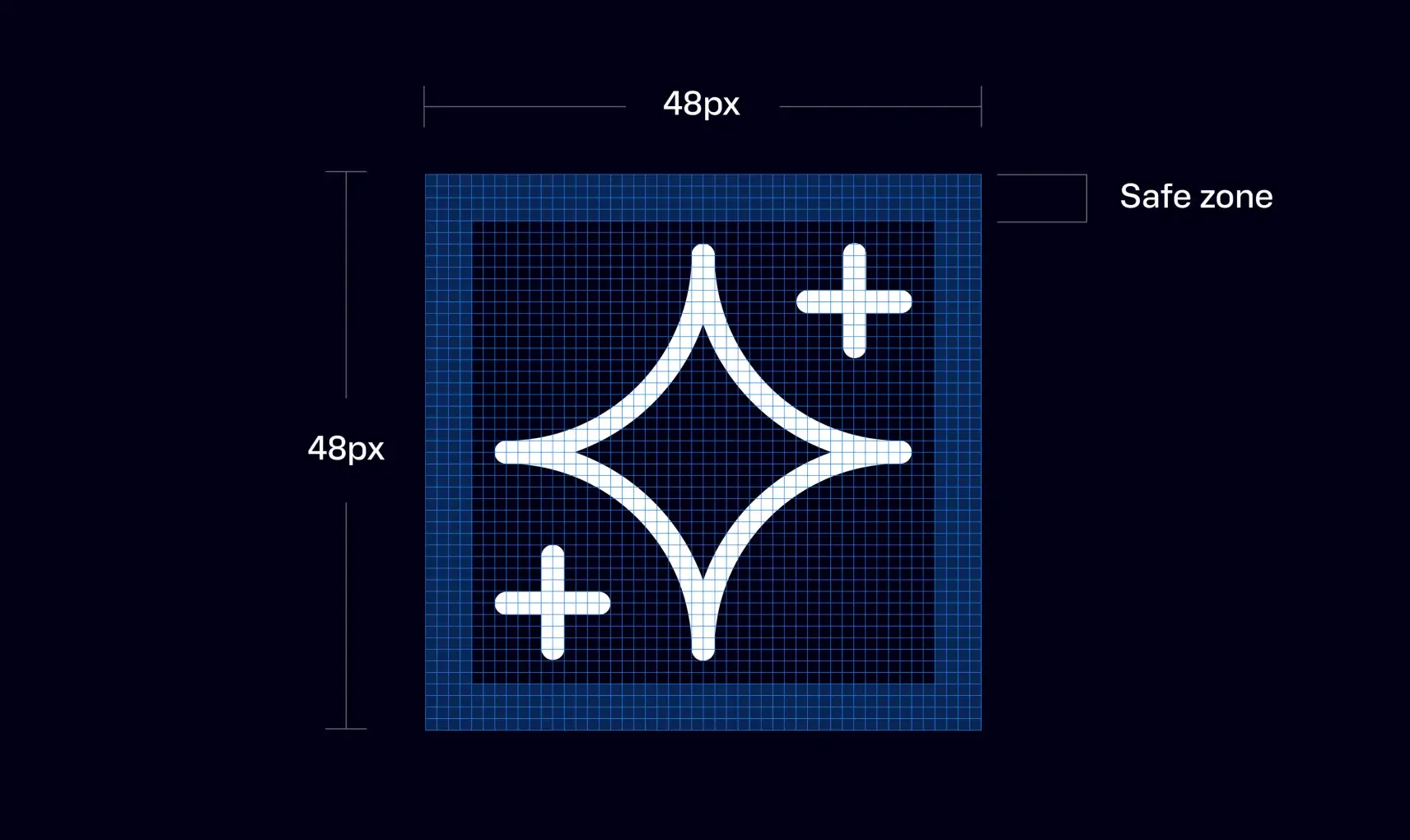
Our icons are created using a square pixel grid as the foundation. There are 5 grid templates available, each with a different number of pixels. The final size the icon will be utilized will determine which grid you’ll need. The example above demonstrates the 48px grid. Using the grid to draw your icon provides a consistent guide. Safe zone padding ensures icons will retain their desired scale and surrounding white space. Do not expand the icons into the safe zone. The safe zone thickness may change depending on which pixel grid is selected.
Grid Template Sizes
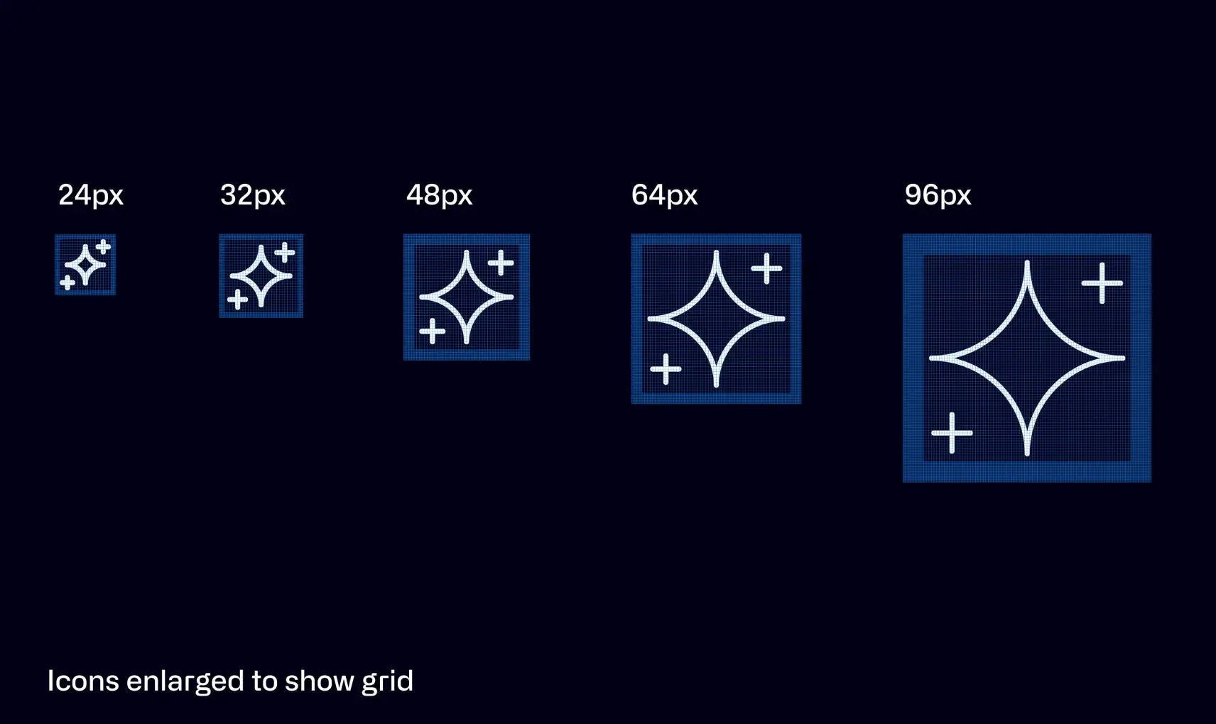
Select which pixel dimensions are appropriate for your design piece and choose that corresponding grid when using or creating icons.
Strokes
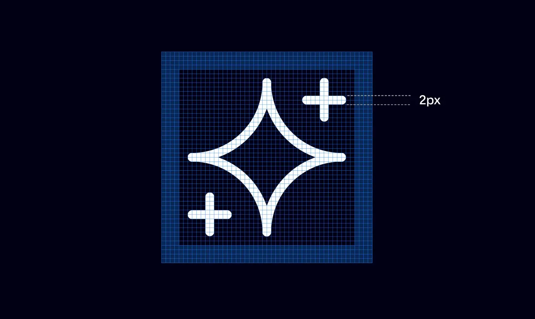
All icons should strive to use a consistent 2px stroke width as they scale across small to large grids. However, grids are there as guides and at times you will need to optically deviate from them to balance a design, such as optically reducing the stroke weight less than 2px.
Angles

Use consistent 15 degree increments when possible to help define common angles.
Glyphs
The following shapes can be used as bullets next to typographic lists and graphic embellishments. These should be used primarily at a small scale.

Photography
Our photography captures the awe, wonder, and excitement that Space Center Houston offers through the expressions of our guests, incredible exhibits, and unique events. Expanding our library and selecting the most appropriate choices is paramount to our marketing efforts.
People
Natural expressive moments of awe, wonder, and delight. We show real smiles, not fake ones.
Subjects that are diverse in ethnicity, age, and gender. Everyone should recognize themselves and their community through our photography.
Every photo feels like there’s a backstory and a connection to Space Center Houston.
Light, Color, & Focus
When outside or near a natural light source, natural, crisp, daylight is preferred.
When appropriate, cast lighting on faces is encouraged (gives a space-esque feel).
Crisp focal points on faces, shallow depth of field backgrounds.
Look to inject colors from the brand palette (blues, blacks, grays) through smart use of propping, clothing, and background elements.
Composition
Low heroic vantage points create visual interest and an epic feel to our photography.
Composition should feature a clear focal subject so you feel like you are in the room with them.The situation should feel composed but not posed.
Uncluttered Backgrounds
People can look into the camera or away from the camera–whichever is most genuine–but we should always see part of their face, so that we create an emotional connection.
Setting
Locations will span the various environments on the Space Center Houston campus, indoors and outdoors.
People
The magic of Space Center Houston is captured through the expressions, body language, and interactions of the people we photograph. The emotions conveyed are a reflection of the feelings we want the viewers to feel about Space Center Houston.
Portrait
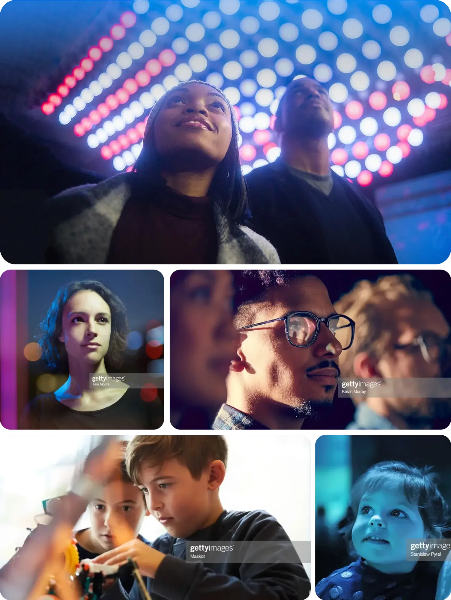
Full Portrait
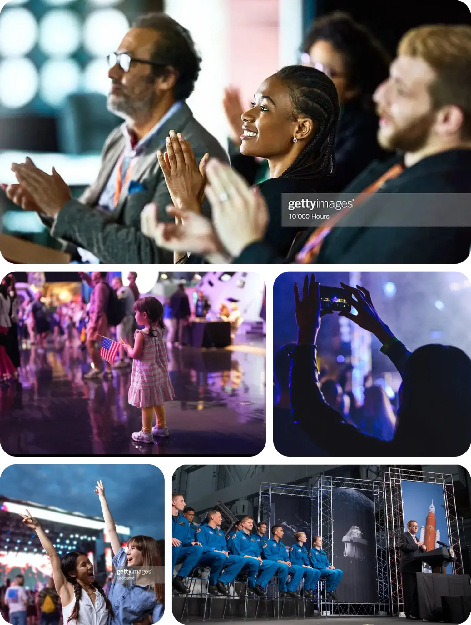
Events
Our event photography captures specific moments in time that ladder up to painting a broad picture about that event. Each image tells a small story about that experience.
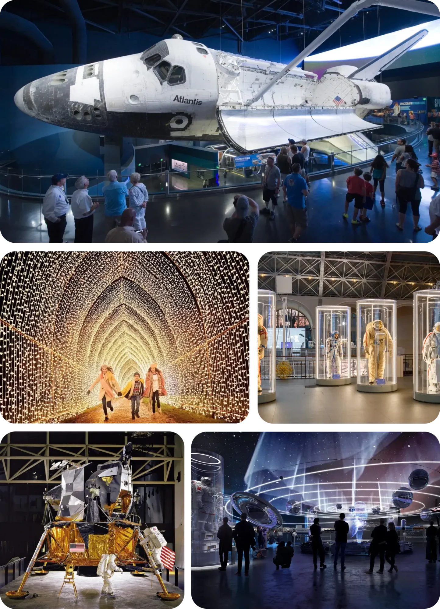
Exhibits and Installations
Our exhibit and installation imagery seek to convey a sense of wonder and excitement through an epic sense of scale, context, and history. Note: Examples below shown for demonstrative purposes only and to be updated with actual Space Center Houston exhibit imagery after future photoshoots are conducted.
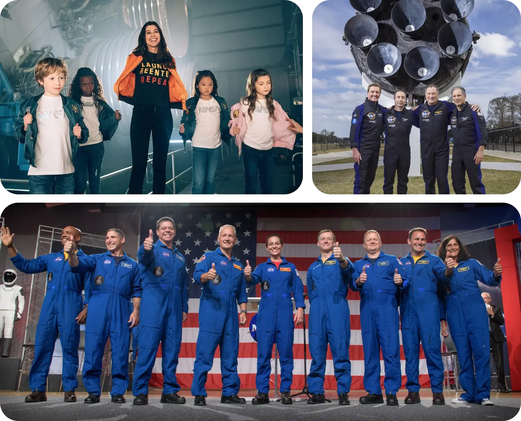
Space Exploration
Images that involve space exploration have innate qualities of beauty and awe. These images are welcomed additions to our library and are encouraged to be leveraged as eye catching visuals when the context is appropriate.
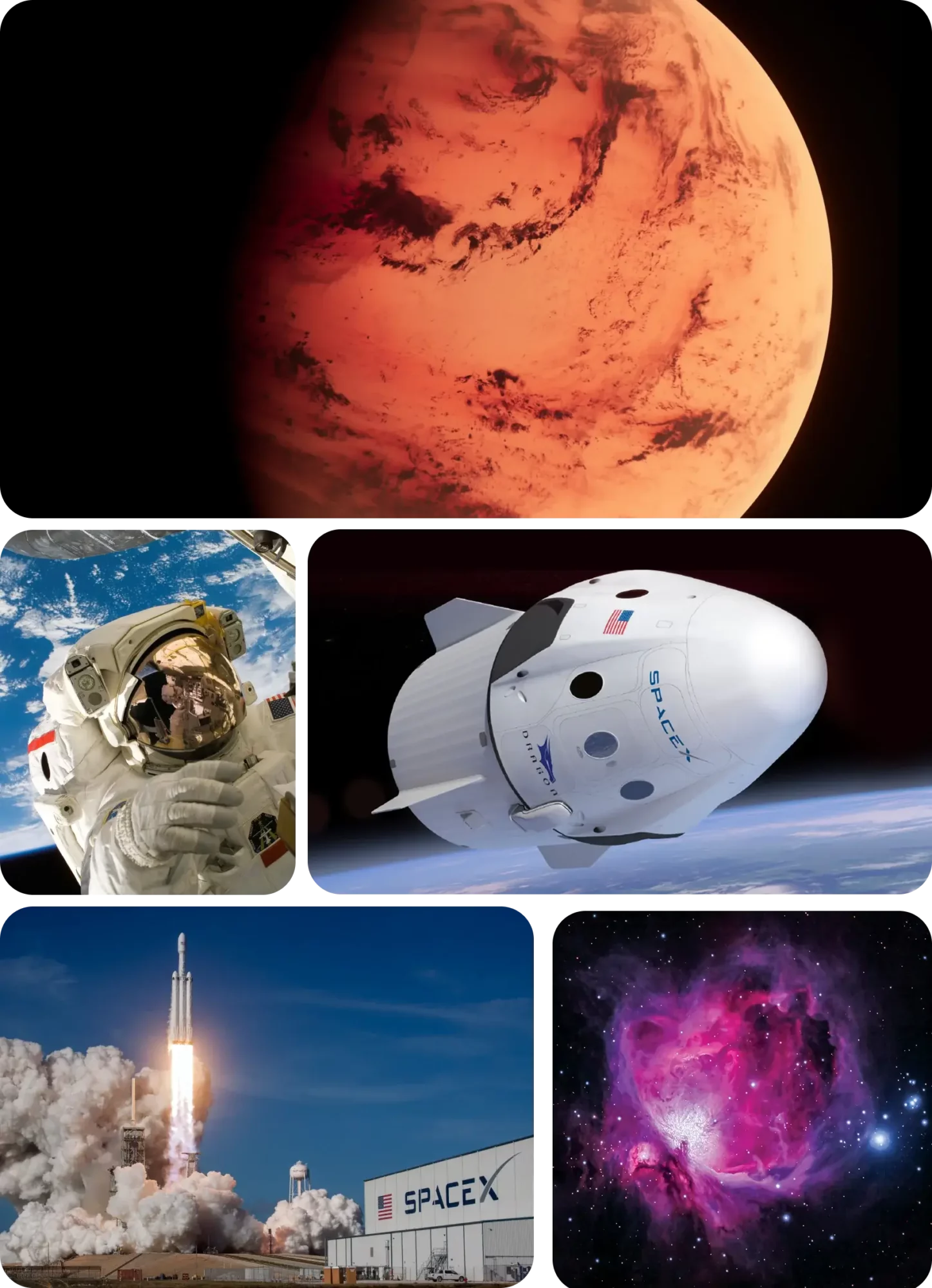
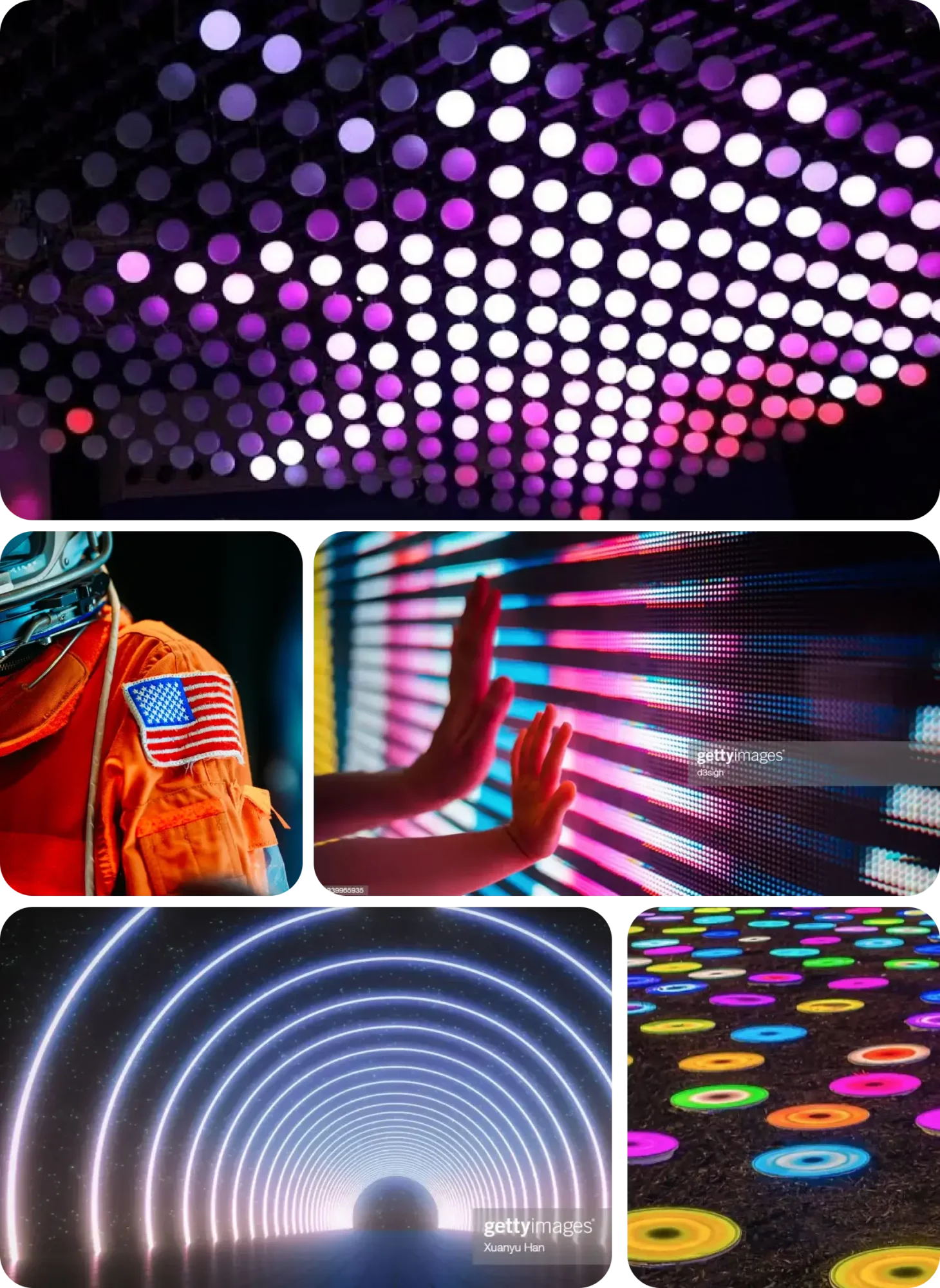
Textural Images
Textural images artfully capture moments within our space that may otherwise go unnoticed. These can be patterns, textures, and other details that when focused on, can add richness to the visual storytelling.
Incorrect Usage
Here are some of things to avoid in our photography.
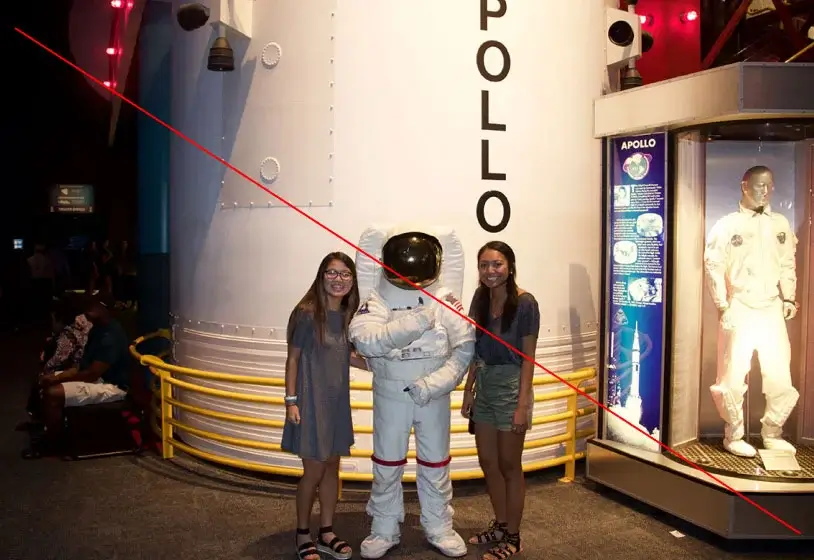
Avoid poor lighting and overly posed shots.
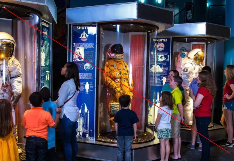
Avoid crowded images without a clear focal point.
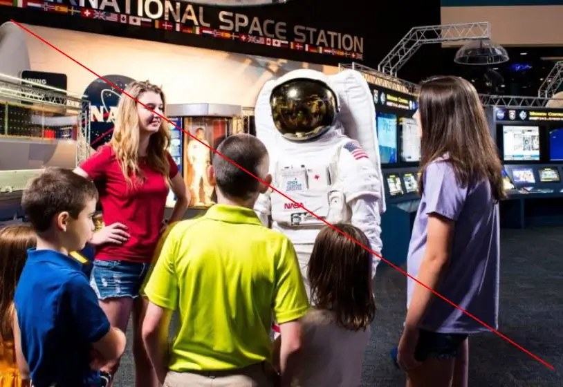
Avoid situations that lack interest, excitement, or emotion.
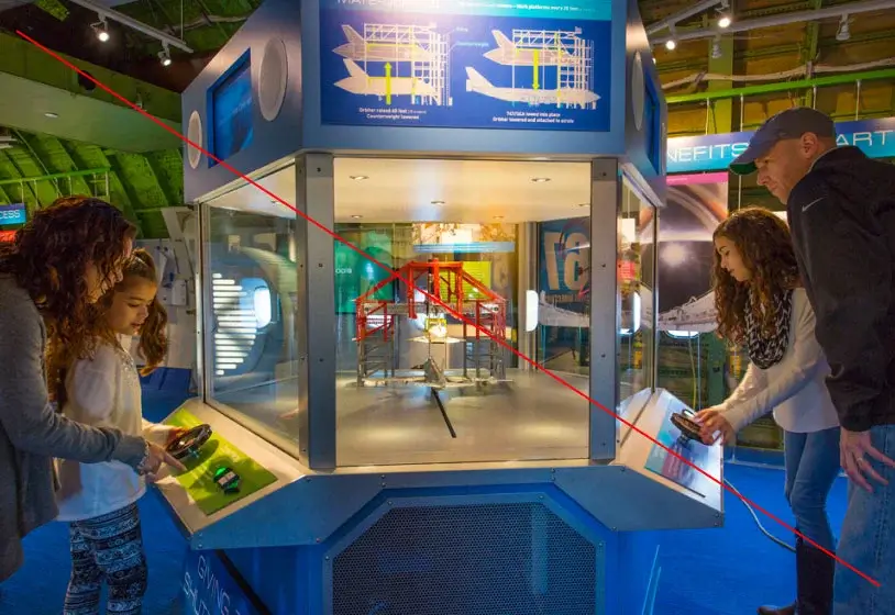
Avoid divided focal points.
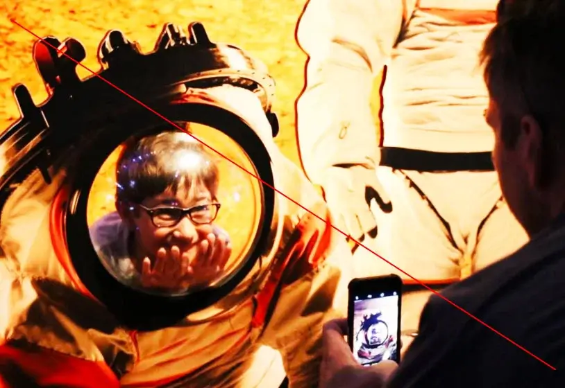
Avoid overly contrasted and/or stylized image treatments.
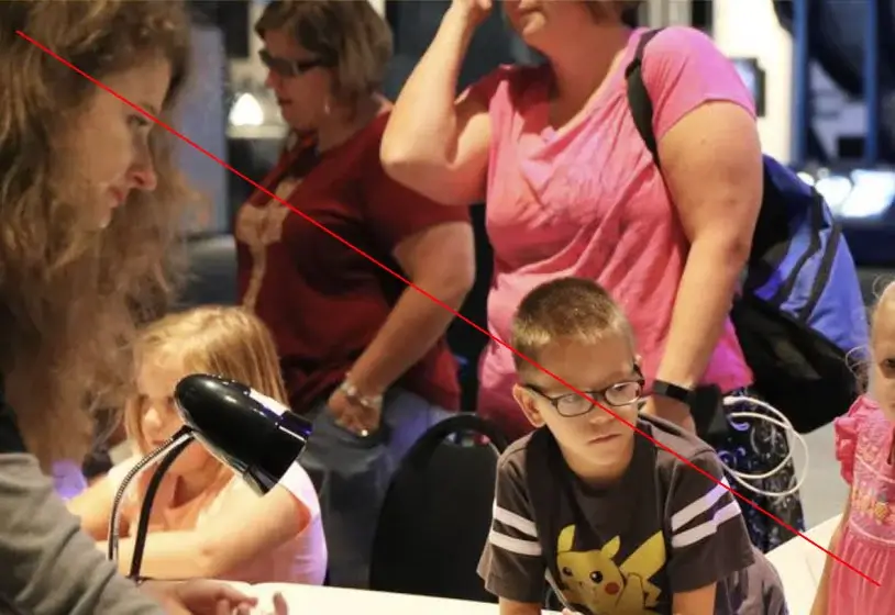
Avoid images with expressions that could reflect disinterest verses awe and/or excitement.

Avoid space images that appear to be science fiction or are overly rendered and stylized.
Image Treatments
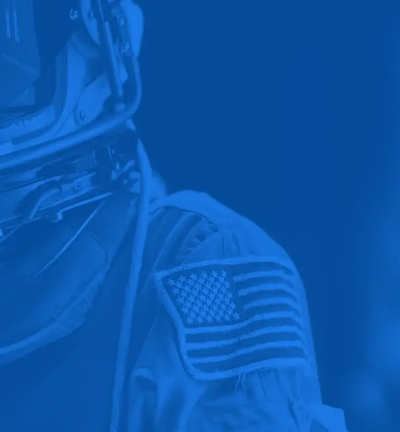
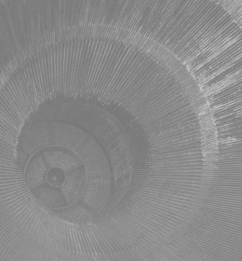
DownloadIn select instances a duotone treatment may be applied to our brand photography.
Duotones
Blue duotone
Gray duotone
How to Use
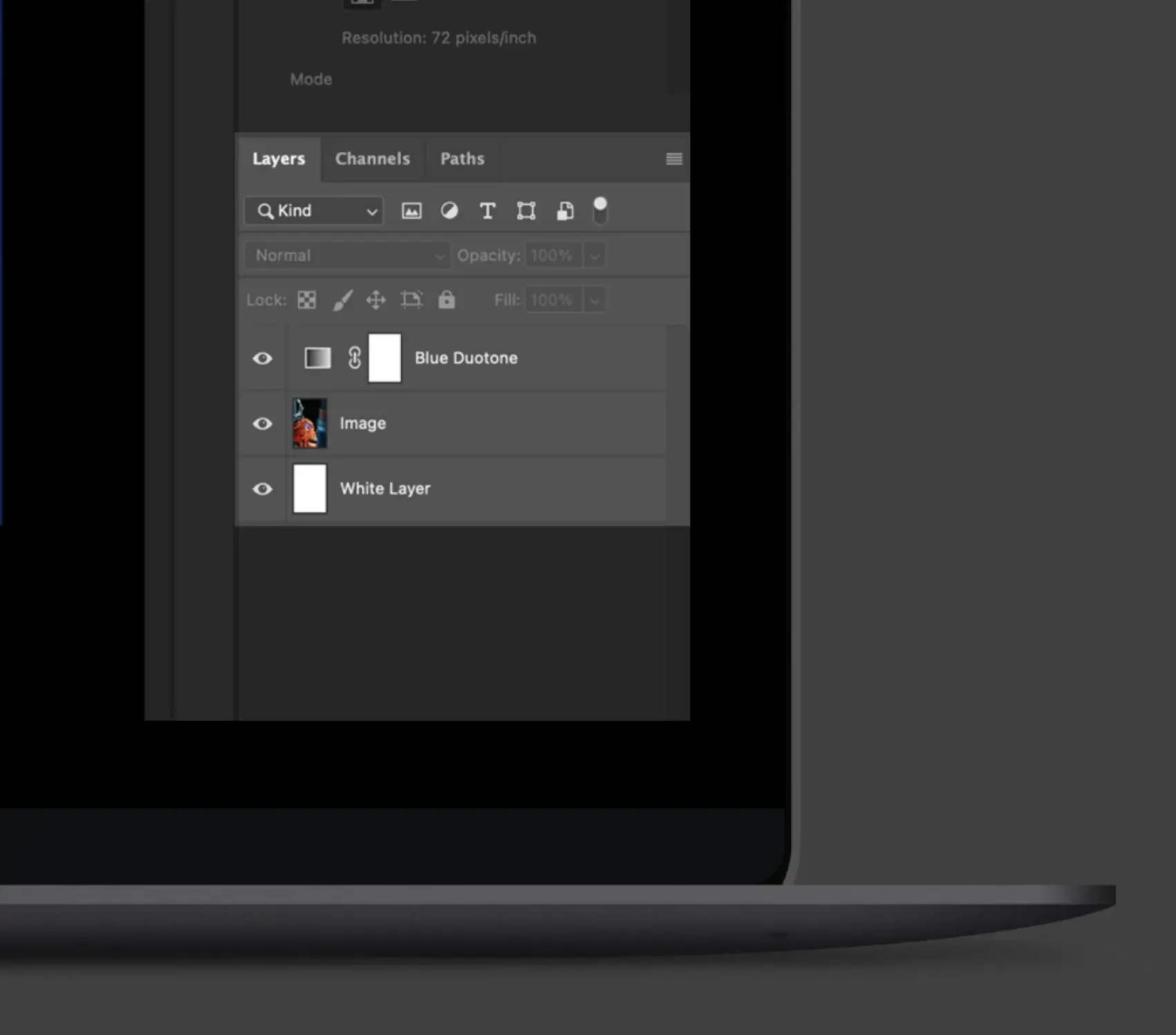
Download the duotone PSDs from the link above or the Downloads page. To create the duo tone effect in Photoshop, open either the “Blue_Duotone.psd” file or “Gray_Duotone.psd” file and drag the gradient map layer (entitled either “Blue Duotone” or “Gray Duotone”) onto the top layer of your image file. Make sure there is a solid white fill layer below your image layer. Adjust the opacity of your image layer to achieve the desired contrast amount (typically between 50%-100%).